Pages giving more information about incidents and ideas mentioned on other pages.
The Drawing Course
Note: when the events described below began the 14, 15 & 16 yr olds involved were 4th and 5th year pupils. By the time I left they had become Y10 & Y11. And since I left they’re now students not pupils. To avoid confusion I’ve used the modern designations (mostly).
Sometime in the eighties the way I taught Art changed dramatically. I didn’t make this change on my own but in collaboration with John Bevan whom I first met in 1975 when I became a teacher at Tulketh High School. John left Tulketh just a couple or so years after my arrival (to become Head of Art at Lostock Hall High School). But those two years were the beginning of a lifelong friendship. For the next twenty-odd years we met weekly to play snooker, drink whisky and talk about Art and Art teaching. And in between times we would visit each other’s houses to check out the occupant’s latest creative endeavour.
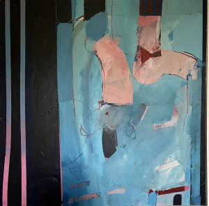
John Bevan Painting from around the period of the Drawing Course
We were very different artists, John and I. The kind of work I was doing is documented elsewhere (see History). John was a painter. His artistic hero was Roger Hilton and his semi abstract paintings reflected the fact. But despite our different approaches we found much in common in our general understanding of Art and the processes by which it is made. We exhibited together too, on three occasions, all organised by John; his practical aspirations were more active than mine and I tended to follow on his coat tails when it came to getting my artwork displayed.
And it was he who was the initial driving force behind the revolution in our approach to the teaching of Art.
One evening as we drank our second large scotch of the evening he announced that he was going to abandon all the skill avoiding, paint dominated exercises that had characterised both our teaching and instead attack the problem head on and teach the kids to draw.
The embryo of this idea had appeared briefly at Tulketh when John had handed out A1 sheets of grey sugar paper, along with sticks of charcoal and had each of his students fill the paper with a drawing of their shoe. The results were impressive – impressive enough for Head of Art John McKay to put a selection of them up in the school entrance hall (and allow all the staff to believe that it was his students that had produced them).
But that was a one off.
In that post snooker, whiskey assisted conversation some years later we both committed ourselves to the project.
I can’t recall too much of the early experiments. I do remember setting up a still life for a Y10 group and talking through the whole panoply of measuring techniques – checking relationships and angles and looking at the negative shapes – and then helping them individually. It was by no means a failure but given the allocation of a mere two hours per week it was unlikely that progress was going to be significant enough for these external exam bound students. Indeed when I went to see the Head, Ralf Jones, to explain my intentions (as in our intentions) and seek his approval, I told him that the results could well go down, at least temporarily. Nevertheless he agreed that I should go ahead. John’s Head wasn’t so accepting; he called in the county Art Advisor, a chap called Nigel Edmondson, who knew John and backed him.
And it was John who came up with the solution. It did involve a small compromise in that it reduced some of the structural problems but the benefits were huge. Like all the best ideas it was, in essence, very simple: to draw small objects on very large sheets of paper.
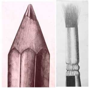
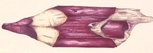
Pencil & Brush (by my pupils). Both on A1 cartridge paper, the width cropped laterally to fit the image shape.
But what small objects? The kids were going to need one each.
John’s solution was to use the everyday objects that the art department was full of: pencils and brushes. But not the whole things – just the interesting bit at the business end.
Both these objects were structurally simple – the pencil was no more than a triangle and a rectangle with a zigzag dividing the two. The brush is slightly more complicated but easy enough with instruction. But it’s what is going on inside these simple shapes which is interesting. In both cases there are three different textures to look at and portray. And of course in order to decide what kind of marks to make it is necessary to look – by far the most important activity involved in representational drawing. Which is where the disparity in scale between object and drawing comes in. Having to fill in even a few square centimetres of paper with representative marks forces the mark maker to look critically and intensely at the few square millimetres of the subject matter; something they are far less inclined to do without this difference in scale. Of course the student needed guidance and it helped the second cohort doing the exercise to see the solutions that their predecessors had come up with.
But it worked and some of the results were spectacular. More importantly, all the students managed to produce an impressive and convincing image.
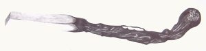
The burnt match. Can’t remember whose idea this was but we both used it.
The burnt match followed, again a cheaply available subject and easy to draw (convincingly if not necessarily accurately with a bit of demo assisted instruction). And once again it consisted of three areas texturally: the head, the burnt stem and the unburnt wood. These delicate objects did present a problem given that the drawings took several sessions to complete and the matches broke easily, but we solved this by sticking each to a small piece of stiff card the better to handle them.
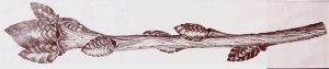 I did something similar with a load of twigs. These involved a slightly greater structural problem but not an insurmountable one.
These drawings along with others, all large and in 6B pencil, were exhibited in the students’ end of course exhibition. This was only possible because the exam was by this time the 16+, a teacher driven answer to the increasingly absurd combination of O level and CSE. It was a wonderfully free exam which allowed art teachers to do their own thing and be judged by their peers on the quality. I doubt that John and I could have developed the course that we did without this short period of freedom. And the grades were spectacular. Far from going down, the results went through the roof.
Of course it didn’t last – the exam that is. Letting teachers do their own thing was never going to be acceptable and the 16+ was soon replaced by GCSE. This was certainly more prescriptive examination but not dramatically so. We had to submit a course outline for approval. Mine was 90% bullshit but it was not merely accepted but praised. The one dramatic change that our courses now involved was the introduction of colour. Many of our pencil drawings became coloured pencil drawings.
A coloured pencil drawing of a coloured pencil. (Spot the undeliberate mistake)
John and I had, by this time, begun to diverge slightly in our approaches, as we inevitably would given our different approaches to making Art. The differences were slight, particularly in those early days but whereas I was more inclined to go for representational accuracy John encouraged his students to explore the texture and mark making possibilities more creatively. This is not to say his kids’ drawings weren’t structurally sound or that mine lacked vitality and textural creativity. They both ticked all those boxes. And there was certainly a great deal of cross pollination of ideas throughout our teaching careers.
It really came down to two things: choice of subject matter and devising strategies which enabled the majority of student who didn’t have a fully developed understanding and ability to put a convincing structure onto an A1 sheet of paper.
I tackled the latter head on in the lower school (Key stage 3) and that did begin to feed through as the years went by. It wasn’t dramatic improvement across the board (I only had them for 1 hour a week, in groups of up to thirty) but it did make a difference, in a smattering of cases markedly so. But for the upper school kids – those who had opted for Art – the course inevitably involved an element of compromise because of time pressures and the fact that a life affecting exam was at the end of it. So the work needed to be challenging enough to result in learning and a continued improvement in drawing skills whilst resulting in work which would impress the markers.
First the strategies. Drawing a small object on a very large scale is a challenge for even experienced artists, and what experienced artists do is use a grid. Almost all the Y10 & 11 work produced in my art room over the years involved grids. The student would draw a small life sized drawing of the subject matter – like the twig above – and would then (with a little mathematical help), scale this up to AI size. After that it was down to looking at what was going on inside the shapes and draw what was there.
I did, to save time, resort to photocopying these twigs and again use a grid to enlarge it. I should stress that photocopying a twig in those days produced an image which was little better than a silhouette but the gridding system allowed the students to produce a convincingly structured A1 outline. This was, of course, only possible with relatively flat objects. Which brings us to the choice of subject matter.
The simple fact is that some objects are easier to draw, structurally, than others. Take for example an object like a coke can.
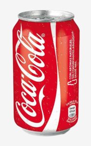
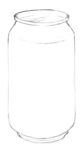
The standard, three quarter, view of a coke can has a structure that is quite difficult to draw, even a simple life size outline. This is my present day sketch of one and it isn’t perfect. Admittedly I started drawing it before accessing the image, which is why the ellipse at the top is too deep, compared with the photograph. For all but the most capable secondary school student drawing an accurate ellipse, particularly in a large scale, is all but impossible.
But crush the can and it’s a different proposition.
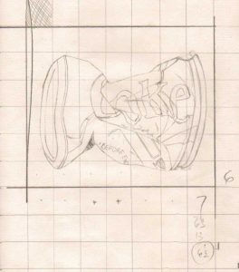
The preparatory drawingThe numbers are mine calculating the grid size for the larger drawing.
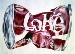
This can, drawn by one of my pupils, an able and intelligent student but not a natural artist, is structurally much easier. It was enlarged using a grid from a life size line drawing but completed by looking and drawing from the actual can. Importantly the image that resulted is more interesting and attractive than a competent drawing of the standard view.
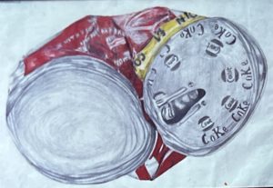 Here’s another. This can has been flattened. This makes it even easier, structurally, to draw. The drawing was produced by a less able student than the one above but is still a convincing and attractive piece of work and a triumph for the boy or girl who produced it.
Natural material also makes good subject matter being both attractive and often structurally forgiving. The problem with some of these materials is that they change over time, and these A1 sized drawings take several weeks to complete. During this time green leaves lose their colour and hawthorn berries shrivel and shrink. I solved this by dipping them in diluted PVA glue and sticking them to stiff pieces of card.
The thin, transparent film which results kept them fresh and unchanging for months.
All the pieces of the puzzle were now in place, as far as the GCSE course was concerned: small subject matter, a life sized drawing of which was then scaled up using the grid system. After that, the basic structure sorted out, it was then down to the student to do the looking, a lot of looking, and drawing – aided and encouraged by a caring, thoughtful and enthusiastic teacher. I never, it should be stressed, helped with the actual drawing; any marks I made were in the margins or on separate sheets of paper. But advice I gave aplenty, and importantly, encouragement. But after reaching a certain stage the drawings themselves became their own motivation.
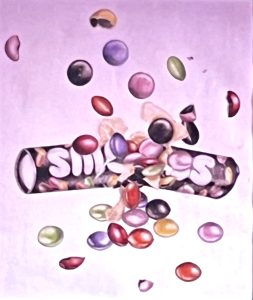
What followed was a search for subject matter with which to feed this system. A walk in the countryside became an expedition to find such fodder as did a visit to the supermarket. The sweet counter in the latter became a rich source.
These are a tiny selection of the A1 (84cm) wide drawings created in the art room. The students who produced them were by no means the cream of the crop. There was the suggestion of movement in several of these images, not least the caramel in the Rolos drawing which did actually ooze down the propped up card to which the whole assemblage was glued. But it was images like the Ice Gem drawing that inspired the idea of the sweet packets exploding.
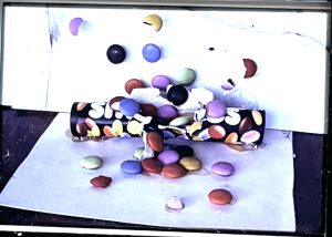
The drawing on the right was produced from the assemblage on the left (viewed from a slightly different angle than the photograph).
The model was produced by the student at home, with help I later learned of her whole family. It was again one of many such models, made by students; it just happens to be one I have a photograph of.
These extensions of the sweet drawing evolved into a whole range explosive ideas:
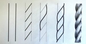
Extract from a worksheet on the structure of a piece of rope.
By the time these images were produced the lower school drawing course was beginning to bear fruit. I will, hopefully get round to a detailed description of this (either below or elsewhere) but briefly, in the first year we looked at shape – examining such elements as proportion, angle and curvature, plus tone – and the way it creates depth and form – and texture. In later years we analysed the structure of various objects and material. One example was rope.
Exercises like this fed into the GCSE course and enabled pupils to tackle more complex subjects on the usual A1 scale. It is, course, more interesting if the rope or cord is attached to something which led to another popular and readily available subject – keys. Here again, work done in the lower school, on texture (of shiny metal), for example, paid dividends.
These drawings and paintings are by a Y9 group. The paintings were created from the drawings and painted in water colour, the glass being painting exclusively with Hookers Green Deep.
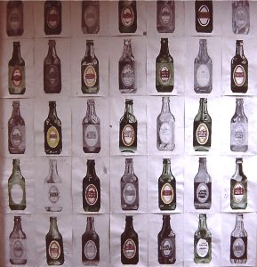
And so it went on. I explored glass of various kinds for example. A weekend get together with friends provided a plentiful source of material. The group of drawings and paintings on the right are by a third year group. The bottle outline was produced using a cardboard template in which the rest was drawn by the pupil.
The single image was Y10 drawing, again produced using a template. The image below shows the whole group’s drawings
In some years I began the GCSE course in Y10 with this exercise. It built confidence and, for those students who needed it. provided a 5th of their final exhibition.
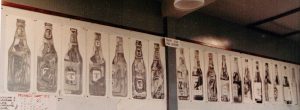
Below are a small sample of drawing featuring glass.
John and I continued to meet regularly through these years and there was a definite exchange of ideas. One which John came up with was the checkerboard. This was a piece of 10cm square piece of mounting board on which the students drew a 2cm chequerboard design. To this they added small items of their choosing.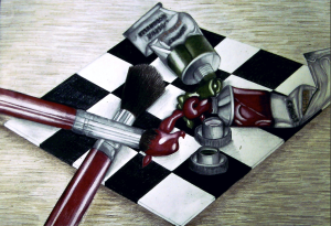
Life size drawing of one of the checkerboards. This was scaled up to A1 size and the drawing completed from the object(s)
The beauty of this is that from a birds-eye view it had a ready made grid and was structurally relatively easy given the correct choice of subject matter. A more natural view obviously presents a greater structural problem but by spending time drawing the checkerboard grid on its own (life size of course) it became relatively easy for a reasonably intelligent, averagely hand/eye coordinated pupil to add in the objects. Looking now at some of the subject matter, particularly the smoking related objects (see below), does give me pause for thought. At the time my focus was on the aesthetic properties. If it looked good it was good. And maybe I was happy to take advantage of how such rebellious statements improved the teenage artist’s motivation to produce a good drawing.
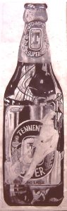
Less controversial was an extension of the glass subject matter above. One of the interesting things about the first three drawings (three of many that various students produced) was the viewpoint. This eye level view, much loved by advertising (where it’s achieved using a telephoto lens) is one I explored in a series of artworks I did in the seventies.
This brings me to an interesting observation. The drawing of the Maxwell House jar half filled with chestnuts is obviously a classy piece of work – the chestnuts themselves are beautifully drawn. But the ellipse at the top is slightly off. Ellipses are extremely difficult to draw and despite me having spent time on them with the upper band Y9 classes, most 15/16 year olds struggled to draw them convincingly. Which is one reason why, with GCSE students, I tended use the eye level view illustrated on the other three drawings. But there was another reason. I liked it. It has a quality, a power almost, which the more normal view lacks – which is why advertisers like it.
Which brings me to a more general point, which is the extent to which I was making the major aesthetic decisions. This is not to say that there was no input from the students; they were, after all, deciding what went in the jars just as they were deciding what was on the checkerboards. And they still had to draw the things.
But I had the power of veto (which I tended to use on purely aesthetic grounds – see above) not to mention taking an executive role in arranging the things. The simple fact is that the subject matter that I gave the thumbs up to was stuff that I found attractive, interesting and exciting. And so, inevitably, were the large coloured images that resulted, the A1 sized drawings which adorned the walls of my art room, which is were they ended up at the end of each Y11 lesson. It may be arguable but in retrospect I am, nowadays, inclined to think of these drawings as being, at least in some degree, my artwork, produced through the medium of GCSE students.
Subject matter like those used to produce these Arcimboldo inspired drawings.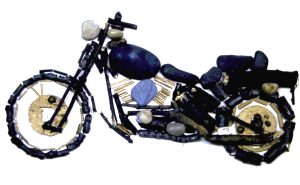
This was my demonstrated motorbike relief made out of twigs, stones and the odd bit of cardboard.
There were not admittedly very many of these. They came towards the end of my career and only really worked with intelligent, imaginative and committed students of which there were, given the school’s changing demographic, a diminishing number.
But there were others. Indeed the illustrations on this whole page represent a tiny fraction of the drawings and paintings produced in my Art room during this period. I taught the course for more than fifteen years and assuming a very conservative estimate of twenty pupils per year, each producing and exhibiting an absolute minimum of 5 drawings per pupil that represents at least 1500 artworks (mainly drawings and a few paintings). Needless to say the ones illustrated are the result of selection, both those I chose to photograph at the time and those selected from for inclusion on this page. Obviously they tend to be the ones I want to show off, but not necessarily because they are best but because they are representative of a particular subject matter, trend or idea . (And there are none, for example, by those rare exceptionally talented students who appear every three or four years or so. They aren’t represented here because I tended to let them go their own way.) And whilst it is true that the intelligent and committed were capable of tackling more difficult subjects some of the most satisfying drawings were produced by students from the lower sets.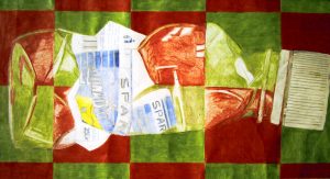
This is one of my favourites. The student who executed is had limited skills but listened, took advice and persevered, and the result was, I think, a triumph.
I can’t really remember but it’s a fair bet that the student who produced that drawing got a higher grade in Art than in any other subject, and it is true that the exam results were consistently the best in the school. There was one amazing year when the Art department got more grade A’s than all the other subject areas combined. But, ego boosting as that was, the real pleasure was the artwork itself. The feeling I got from seeing Y11 work up on the Art room wall, both mid production and for the end of course display, was something money can’t buy.
So here are a few more:
One final memory. It wasn’t unusual for the occasional Y11 student to decide they’d had enough of school, that they were unlikely to do well enough in the GCSE exams to make a difference in their lives. And so, in the parlance of the time, ‘They did one’ – went off to start their lives outside education. Two girls who had opted for Art made this decision and left before the GCSE exams and assessments took place. But before they went they sneaked into the Art room one lunchtime and made off with their drawings. They might not value the GCSE certificate but they did value the work they had produced in pursuit of it.